Page 4 of 4

Re: New Ogre logo proposal :)

Posted: Sun Mar 13, 2016 10:29 am
by spookyboo
I like it, but it probably does not stick out on the new website

Re: New Ogre logo proposal :)

Posted: Sun Mar 13, 2016 1:38 pm
by moejac
What I meant with 'combining' them was to invert number 3 and replace the Ogre in the green version of the revised image - I think it would work better if the text was under the 'head' - if you understand what I mean.
The number 3 logo (text) works best if inverted on a green background, I think. :)

Re: New Ogre logo proposal :)

Posted: Sun Mar 13, 2016 1:48 pm
by moejac
Image

Re: New Ogre logo proposal :)

Posted: Sun Mar 13, 2016 1:50 pm
by moejac
Alternatively, side by side, but still white on green.

Re: New Ogre logo proposal :)

Posted: Mon Mar 14, 2016 2:40 pm
by Herb
This is very subjective to each person, but I thought I'd chime in. Really like simplicity. The simple one color Ogre (being white) on the green background looks great. It also allows you to change / invert the colors for different scenarios and you still get the same brand recognition. My thought was on the the word "ogre". I think mixing that simple ogre graphic with a clean text (without the horns) is more stylistic. Below codrer's earlier post does this. Open the exact font for "ogre" but really like the work being done on this.

Image

Re: New Ogre logo proposal :)

Posted: Mon Mar 14, 2016 4:37 pm
by spookyboo
I really like this one (without the horns)
+1

Re: New Ogre logo proposal :)

Posted: Mon Mar 14, 2016 10:36 pm
by moejac
What would be cool to have is an image with transparent background so that it would blend into whatever background colour used. I like the last one posted best too.

Re: New Ogre logo proposal :)

Posted: Mon Mar 14, 2016 11:15 pm
by dark_sylinc
I feel I need to chime in.

After 4 pages, this is beginning to feel like those paid commissions where the artist is stuck in hell because everyone (the client's girlfriend, his kid, his colleagues, his mother, father, uncle, grandmother, and his dog) is voicing their opinion and the artist presents 10 different designs and never deciding for one.

And btw the client is not paying until the artist presents them "something good" (meaning: something absolutely everyone he knows will love with no objection, which ain't gonna happen because taste is subjective).
It's not that their feedback is not valuable, but at some point the one who is supposed to make a decision needs to grab the wheel, make a decision and screw the people who didn't like the particular design he's going for.
If that doesn't happen the artist becomes stressed, burnt out and depressed, sends his client to f@#k off, and never comes back. And we're left with the old logo.

This phenomena is just not as noticeable here because people are doing this for free in their free time. But I can recognize it's burning people out.

Because in our Ogre3D team we're handling things democratically, we don't decide right away for a logo (mostly Murat, Phillippe and myself are into the logo and website stuff).
The truth is, we had chosen a logo for the website some weeks ago. It was the green variation of this:
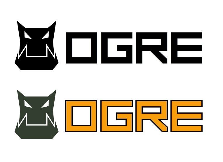
Image
However we had to remove it because the top bar in the main website shrinks when you scroll down. When that happened it looked terrible due to filtering/scaling issues. It was particularly bad with the border outline in the letters, but the face itself also presented aliasing in their diagonals which flickered when zooming out gradually.
We realized we needed an SVG logo (or a blurred PNG without hard edges / small lines; like the current version which is the old logo).

So rather than keep discussing which variations are better, it is far more important to submit the work in SVG (or other vector-based format that can be resolution independent). File size can't be larger than 10kb. SVGs containing non-vector-based embedded images won't be considered.
Most of the submissions have been really great. So please resubmit in SVG. We can worry about the details later. Those are subjective (has a ring, hasn't a ring, has horns, doesn't have them, looks too hipster, too modern, etc, etc).

I don't mean to offend anyone. Making art decisions is harsh (someone always gets offended), and I need to take the wheel because we're clearly moving in circles, getting nowhere with a flawed premise since we didn't lay out submission requirements as this topic was started by a well intentioned contributor who thought it would be cool to have a new logo and the topic just happened to get too popular.

Re: New Ogre logo proposal :)

Posted: Mon Mar 14, 2016 11:40 pm
by xrgo
lol, although you're right... this topic is from october xD and it was time for someone to moderate and start taking decisions... I was having fun discussing the submissions :P
I was wondering maybe we could make a poll with the proposed logos before taking a final decision?
But if you like my logo (heavily inspired by Miki's one, 95% of the credits to him) here it is in svg format =)
https://www.dropbox.com/s/zuqrylm4ygq53 ... o.svg?dl=0
dark_sylinc wrote:or other raster-based format that can be resolution independent
shouldn't that be "vector-based"??

Re: New Ogre logo proposal :)

Posted: Tue Mar 15, 2016 12:46 am
by moejac
Thanks for that dark_sylinc - you can lock this topic now I think.

Re: New Ogre logo proposal :)

Posted: Tue Mar 15, 2016 12:52 am
by dark_sylinc
xrgo wrote:
dark_sylinc wrote:or other raster-based format that can be resolution independent
shouldn't that be "vector-based"??
Oops. Fixed.
moejac wrote:Thanks for that dark_sylinc - you can lock this topic now I think.
We'll have to test the SVG version first and see how it goes.

Re: New Ogre logo proposal :)

Posted: Tue Mar 15, 2016 2:25 am
by codrer
+1 I think we were having a good time here^^

Anyway, here is my final proposition based on each feedback. Something quite simple x4 layouts in order to fit any situation (a complete set may be very useful)


Image
http://codrer.com/swap/2016/ogre_header.svg (9.7 kb)

Image
http://codrer.com/swap/2016/ogre_mask.svg (8.5 kb)

Image
http://codrer.com/swap/2016/ogre_full.svg (23.8 kb)

Image
http://codrer.com/swap/2016/ogre_logo.svg (20.3 kb)

Image

Re: New Ogre logo proposal :)

Posted: Tue Mar 15, 2016 4:04 am
by moejac
I guess I should not say this: but awesome stuff Codrer :)
I like all of them! :D

Re: New Ogre logo proposal :)

Posted: Tue Mar 15, 2016 6:09 pm
by Thyrion
codrer wrote:+1 I think we were having a good time here^^

Anyway, here is my final proposition based on each feedback. Something quite simple x4 layouts in order to fit any situation (a complete set may be very useful)


Image
http://codrer.com/swap/2016/ogre_header.svg (9.7 kb)

Image
http://codrer.com/swap/2016/ogre_mask.svg (8.5 kb)

Image
http://codrer.com/swap/2016/ogre_full.svg (23.8 kb)

Image
http://codrer.com/swap/2016/ogre_logo.svg (20.3 kb)

Image
like it! :)

Re: New Ogre logo proposal :)

Posted: Tue Mar 15, 2016 7:39 pm
by moejac
@Codrer: the font that is being used, what's the name of it and is it free?

Re: New Ogre logo proposal :)

Posted: Tue Mar 15, 2016 11:15 pm
by codrer
>> awesome stuff Codrer

Thanks!
Nulshock Bold is free for commercial use such as logos, book covers and posters.
Raymond Larabie
Typodermic Fonts Inc.
Yep it's ok:)
Btw if the Ogre team would rather have their unique custom font, I can provide it.

Re: New Ogre logo proposal :)

Posted: Fri Mar 18, 2016 2:35 pm
by EricB
Codrer could you try the three tone yellow in your new square logos in place of the white? I'm just curious how that would look.

Maybe the devs should make screenshots of how they look on the new site. Then set it up for a vote!